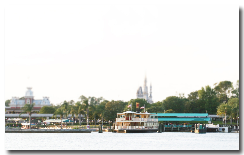
Hey everyone! Has anybody attempted any Tilt-Shift or Fake Model techniques on their Disney photos? If you're not already aware, this technique can be achieved in PhotoShop using lens blur and some image curve tweaking. The end goal is to make sure subject look as much like a scale model as possible. Plastic-like so to speak. I just completed two shots. Click below to check them out. Thanks! Monorail entering the Contemporary Resort: http://www.flickr.com/photos/dawholagn/294685847/ The Magic Kingdom: http://www.flickr.com/photos/dawholagn/294677067/
i do not know anything you just said but those pics look awesome what kind of photo shop do u use? i use microsoft digital image pro
Thanks! I used Adobe Photoshop CS for these. More info can be found here: http://recedinghairline.co.uk/tutorials/fakemodel/index.html
Thanks you. Honestly, I think I spent a total of maybe ten minutes of actual tweaking per image. The rest of the time was spent waiting for Adobe to perform the blur effect. If you have any cool ariel(Aspect, not the red head) photos give it a try! It's a lot of fun to goof with.
Thanks for posting that. It seems a lot of fun and the monorail pic looks so amazing. I'm going to try this thanks again!
You bet! Once you get a taste of this, you'll find your self climbing a lot of stairs to get those wonderful "from above" shots to practice with.
First off, many thank yous for giving me the explanation of how to do this. Well, for referring to the explanation. I've been wondering about this for a while, this is the first how-to I've seen. I've done a few tests of this trick. I don't have anything to equal that monorail shot, that one's excellent. I'm also having trouble judging the quality of what I've done, the more I look at it the more I find the effect wearing off, I'm getting too used to it. I'm too weak with the curves tool, so my ability to get the proper plastic look is limited. Also I don't have a ton of pictures that suit this trick, although I'm trying to be creative in what I apply it to. This December I'm going to keep this in mind though and try to get a bunch more that'll work better. But here's what I've done so far.
Dan, that top photo is a great candidate for tilt-shift! Give it a redo by not using the absolute center of the picture when assigning the lens blur fliter. Remember a tutorial is built to guide you, not to program you. Therefore I urge you to look at your orginal shot and determine where the point of interest stops, and then drag & drop from there. The second photo; I'm not so sure is a candidate for this technique. FYI.. After I completed my first two listed photos, I tried this technique on a few other shots I thought would meet the needed criteria. None of these worked out. Don't get exasperated if your shot doesn't work out. It takes a special shot from a special angle to get that "special" feel that makes this effect truly work. Trust me... I shot gigs ang gigs worth of shots... I think these are the only two who were winners for this effect. Like common photography; it's a live and learn process. With every failure comes more needed practice. Every snap has it's place! 8)
Yeah, I'm still experimenting with the most effective positioning of the gradient mask. As to the second picture, I actually thought that was the better of the two. Perhaps too much was blurred, it might have needed to be cropped a bit more.. but I thought it was better. I think I need to stop looking at them now though, I'm finding it difficult to judge the effectiveness of the trick any more, I've been looking at it too much.
After a second look, I agree with you that the second shot would be a good source. You just have to keep that mask very slim. I look forward to seeing these tweaked!
Here's a shot I just completed. It's not Disney related but kind of fun nonetheless. The subject is Comerica Park in downtown Detroit, MI. This was taken about six hours before game one of the 2006 World Series. I was positioned on the roof of the Hockey Town Cafe. http://www.flickr.com/photos/dawholagn/ ... 370721948/
Actually I used the 24mm TS-E at Epcot in 2000. it was to try and get a decent picture of Spaceship Earth without the wand in the picture without the looking up perspective. Kind of worked. I'll see if I can find the pic.
Tilt-Shift Cedar Pointe Here's a shot from Cedar Pointe. Being from Michigan, I tend to get to this great theme park in Ohio quite often. If you haven't been here yet; I highly recommend it. Especially during their October "Halloweekends" promotion!
i like it but i can see where you need a little more of a vertical element (looking down into the scene) for it to really work. lot of 'dead area' in the sky
Tim is right; but you are on the right path. You did a great job with the color qualities on the ferry and dock! It does look model-like.
i gotta get a shot from 2nd floor railroad station down mainstreet and try this, i can think of a bunch of elevated views this would be cool for, esp some new york city stuff gary
Re: Tilt-Shift Cedar Pointe I grew up in Ohio and went to Cedar Point every year. I love that park. The last time I was there was in 1992. I bet it's really great now! Barrie